
Method Labs
Compared to their counter parts, Method Labs take on beer is a fun (and far less pretentious) process of brewing beer. The objective for this project was to create exciting illustrative designs for the brewery’s products and merchandise. We used their science and laboratory themes to highlight the creative and innovative nature of Method’s approach to crafting
Deliverables: Logo System, Brand Colors, Typography, Packaging Design, Brand Illustrations, Mural Design

LOGos
Fun science fact! Carbon is play a huge role in the creation of life on earth. Since Method’s brand is built around the exciting and sometimes dangerous process of making new things, this logo was inspired by the caution labels of lab chemicals, and the hexagonal molecular structure of carbon.
Typography
The bold nature of Chedros was paired with the sterility of Seravek to reference the look and feel of text often found in laboratories.
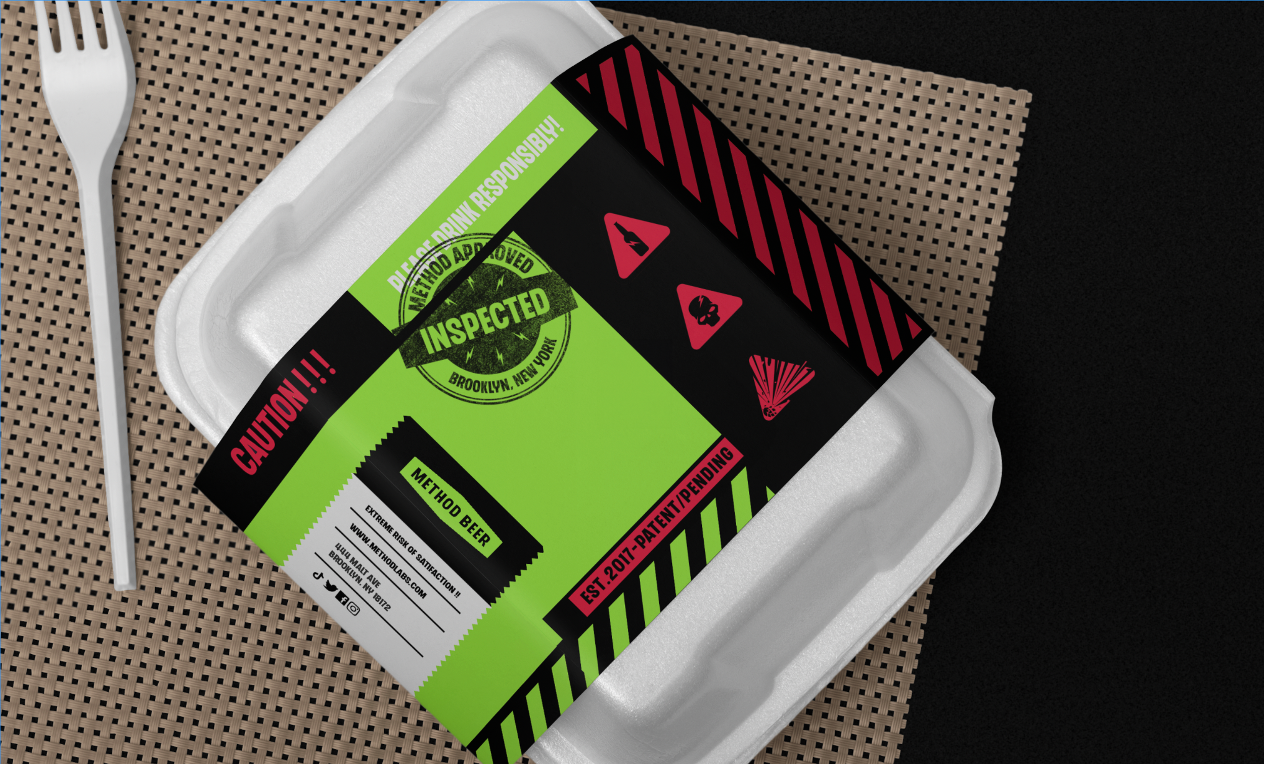
Brand Colors
Some smoke, a little fire, and poisonous mixtures that just might kill you. Method’s brand colors were inspired by the image of a reckless scientist brewing up a whole bunch of trouble in his lab.
Brand
illustrations
Method wanted to be sure their customers knew they weren’t inaccessible jerks, so we created some fun illustrations for their merchandise. Creating new things requires A LOT of activation energy. The lightning bolt was inspired by the reflection in the scientists lab goggles as he watches his latest creation come to life.
Icons
Labs are full of symbols bunch of symbols all trying to stop you from hurting yourself. We used some of the most common warning symbols to create the brands packaging and social media icons.


